cinderella: the australian ballet brochure
THE PROCESS
The brief was to design a print-ready brochure for The Australian Ballet to promote their upcoming tour of Cinderella with a contemporary twist. The challenge was to create a sophisticated promotional piece that aligned with the company's established visual identity while working within strict production limitations. The client required the use of their supplied copy and photography, alongside a cost-effective duotone colour palette created using Pantone Spot Colours.
The design process focused on balancing elegance with practicality. I explored how a limited colour palette could enhance rather than restrict the visual outcome, using duotone treatments to create depth, atmosphere, and consistency across imagery. Typography and layout were carefully considered to reflect the premium, refined nature of The Australian Ballet while maintaining clear visual hierarchy and readability. Material selection and print specifications were also factored into the design from the outset to ensure the brochure would translate effectively from screen to print.
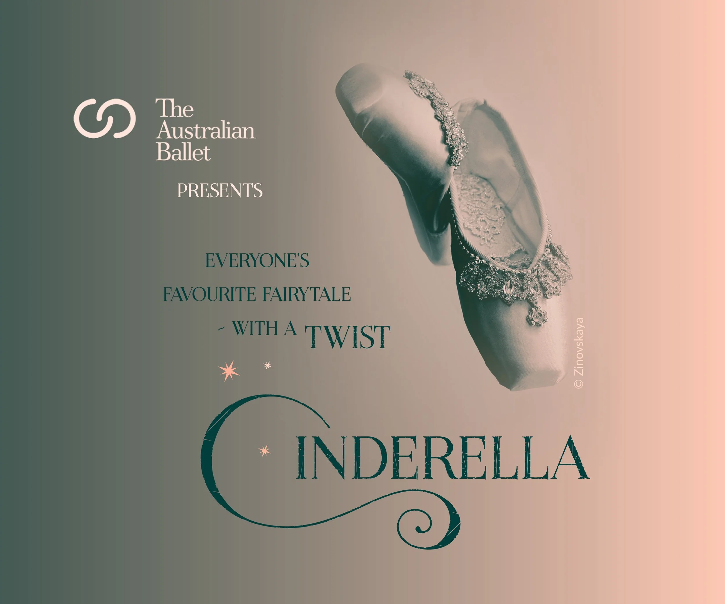
The final brochure successfully captures the sophistication and artistry associated with The Australian Ballet while meeting the client's production requirements. The duotone treatment creates a distinctive visual identity that complements the performance's contemporary interpretation of Cinderella, and the clean layout allows the supplied imagery and content to take centre stage. The design remains visually engaging without relying on a full-colour print process.
The project successfully balanced creative and production requirements by using a cost-effective duotone Pantone Spot Colour palette while maintaining The Australian Ballet's established brand identity. Client-supplied copy and photography were seamlessly integrated, and the final brochure was delivered as a print-ready file with appropriate bleed, colour specifications, and carefully selected materials to achieve a premium finish.
The project demonstrates an ability to design creatively within real-world production constraints. By embracing the limitations of spot colour printing, the brochure achieves a refined aesthetic that is both cost-efficient and visually impactful. It reflects an understanding of how thoughtful design decisions can elevate a project without increasing production costs.
This project showcases strengths in editorial layout, print production, and brand consistency. It highlights my ability to interpret a client brief, develop creative solutions within technical limitations, and deliver professional, print-ready artwork that balances visual communication with practical manufacturing considerations.
THE PROCESS
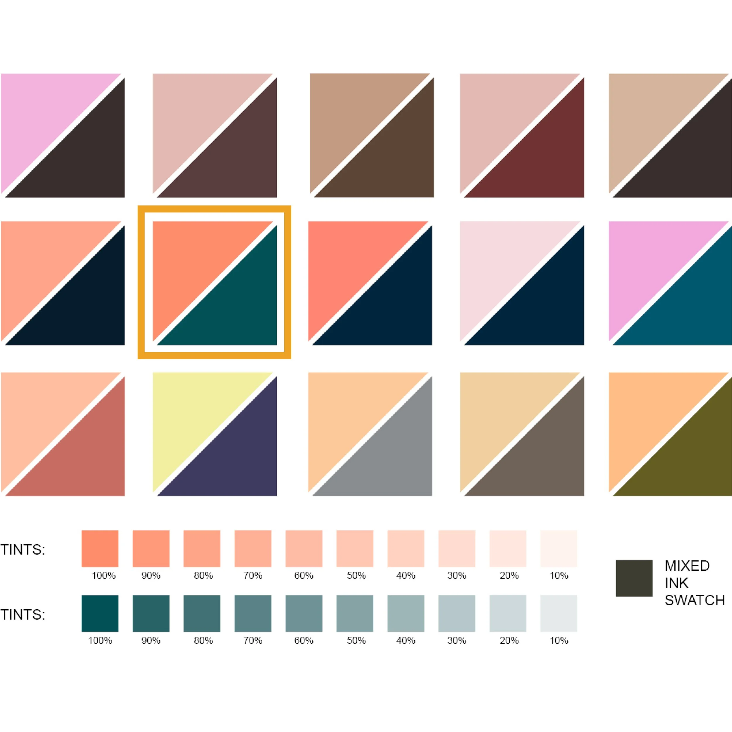
The selection of the final Pantone Spot Colours was guided by visual research and experimentation with a range of duotone combinations. After testing palettes ranging from rich plum and neutral tones to blush pinks, peaches, navy, and teal, I selected PANTONE 1635 C and PANTONE 7476 C for their versatility and contemporary appeal. The vibrant watermelon pink softens into delicate blush tones, while the rich teal tints to pastel blues, creating a palette that reflects both the elegance of ballet and the whimsical atmosphere of Cinderella. Together, these colours also produce a neutral dark grey for typography and supporting design elements, making the palette both aesthetically cohesive and practical for print production.
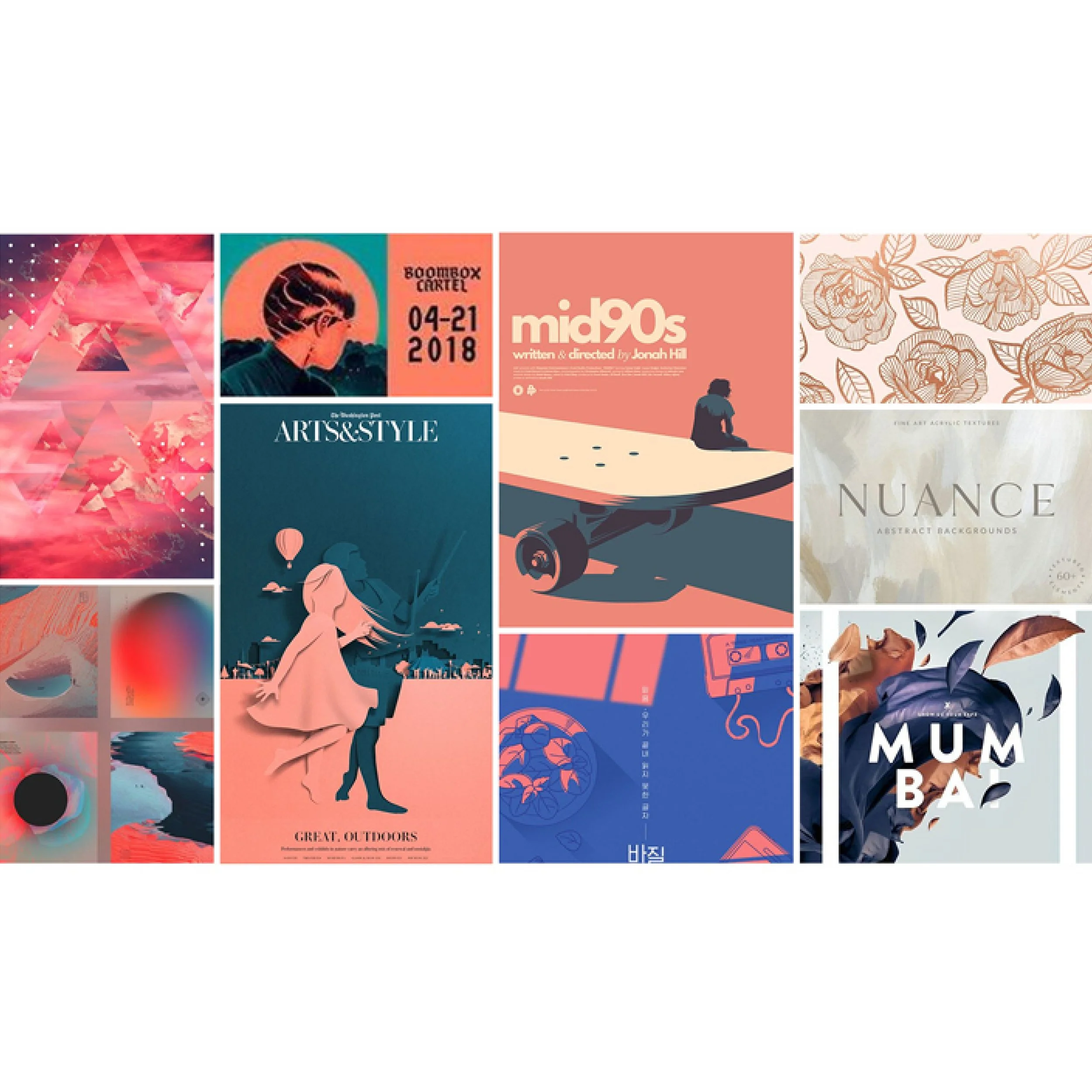
Research into two-colour design provided valuable inspiration and informed the early stages of concept development. A wide range of colour combinations were explored before refining the direction to pinks and neutral tones, reflecting the elegance and traditional aesthetic associated with ballet. I was particularly drawn to pairings of pink with blues and teals, as these combinations offered a contemporary interpretation while maintaining a sense of sophistication. Neutral palettes incorporating pink and gold were also considered for their premium feel; however, given the limitations of a duotone printing process, these lighter combinations were determined to offer insufficient contrast and were therefore not pursued further.
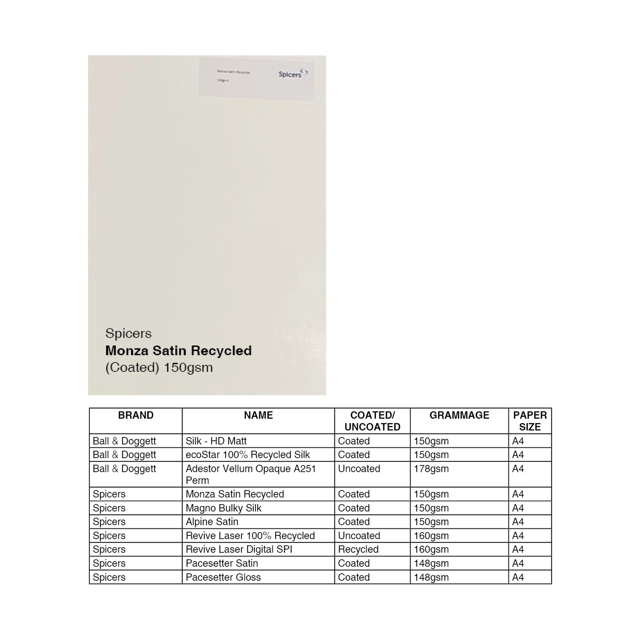
Spicers Monza Satin Recycled was selected as it met both the aesthetic and production requirements of the brief while offering the added benefit of being 100% recycled. Its satin-coated finish enhances colour vibrancy and provides a premium appearance without the glare of a high-gloss stock, ensuring excellent readability. The subtle ivory-white tone and smooth texture contribute to a refined, luxurious feel that complements the elegance and sophistication of The Australian Ballet.