
Pretty Baby Parties needed a bold and recognisable visual identity for its Disney princess entertainment business that would appeal to both children and parents while standing out in a saturated market.
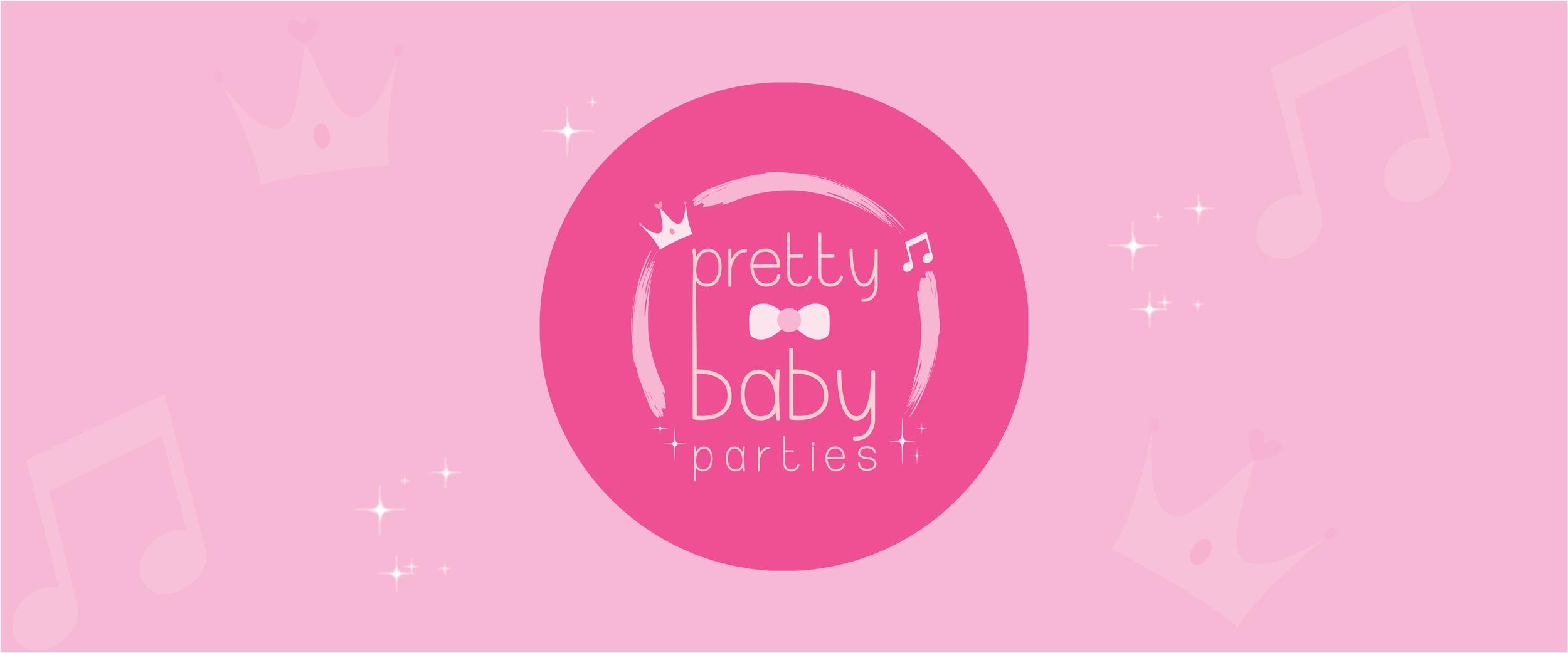
I leaned into the owner’s preference for hot pink and baby pink to create a playful, theatrical brand world. The identity combines quirky typography with clean sans serif type and uses custom brand elements — a tiara with a heart jewel, sparkles, and a music note — to reflect fantasy, performance, and live singing.
The branding is cohesive, memorable, and highly distinctive. Every element reinforces the same energetic and magical personality, making the brand instantly recognisable across social media, print, and live events.
The challenge was creating something inspired by princess culture without feeling derivative of Disney branding, while also balancing a childlike sense of fun with professionalism for parents.
The final identity gave Pretty Baby Parties a strong and unique visual presence that clearly differentiates the business from competitors.
I understood that the brand’s strength came from fully embracing its personality rather than minimising it. My role was turning bold creative preferences into a cohesive and strategically distinctive identity system.